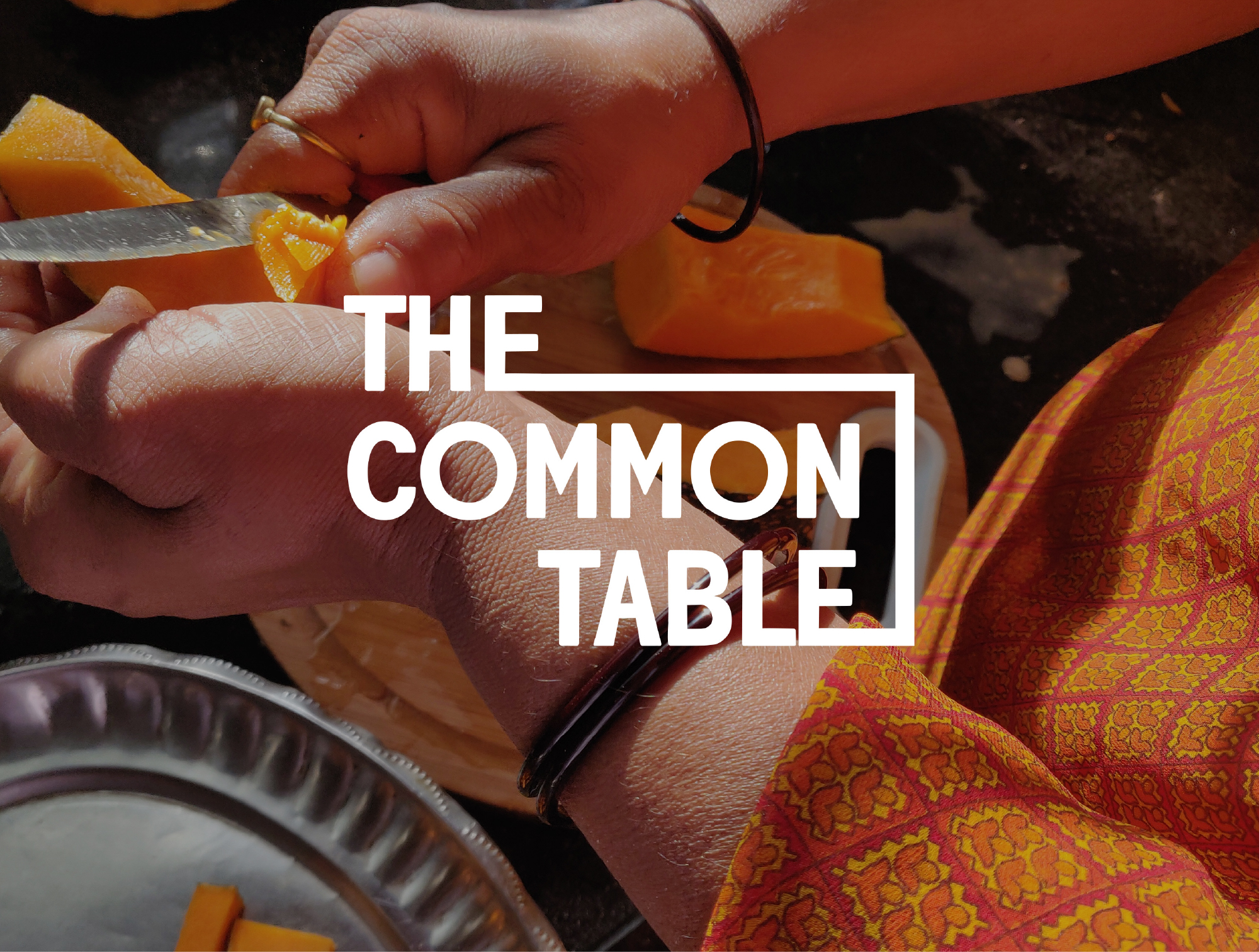
What if a mother-daughter duo could reshape how we think, design, and talk about food systems? That’s exactly what Sophie and Orlando Lovell achieved with The Common Table: a Berlin-born platform for food futures and systemic change.
Project Goals
- Bring diverse food-system stories from around the world to a digital table - building a website to publish the interviews and articles.
- Expand TCT’s presence beyond Berlin through immersive online experiences and newsletters
- Build a coherent design system that translates the systemic nuances and food cultures.


I helped translate the platform’s deep values of transparency, collaboration and critical thinking into a clean, emotive visual identity.
Logo + Brand Identity
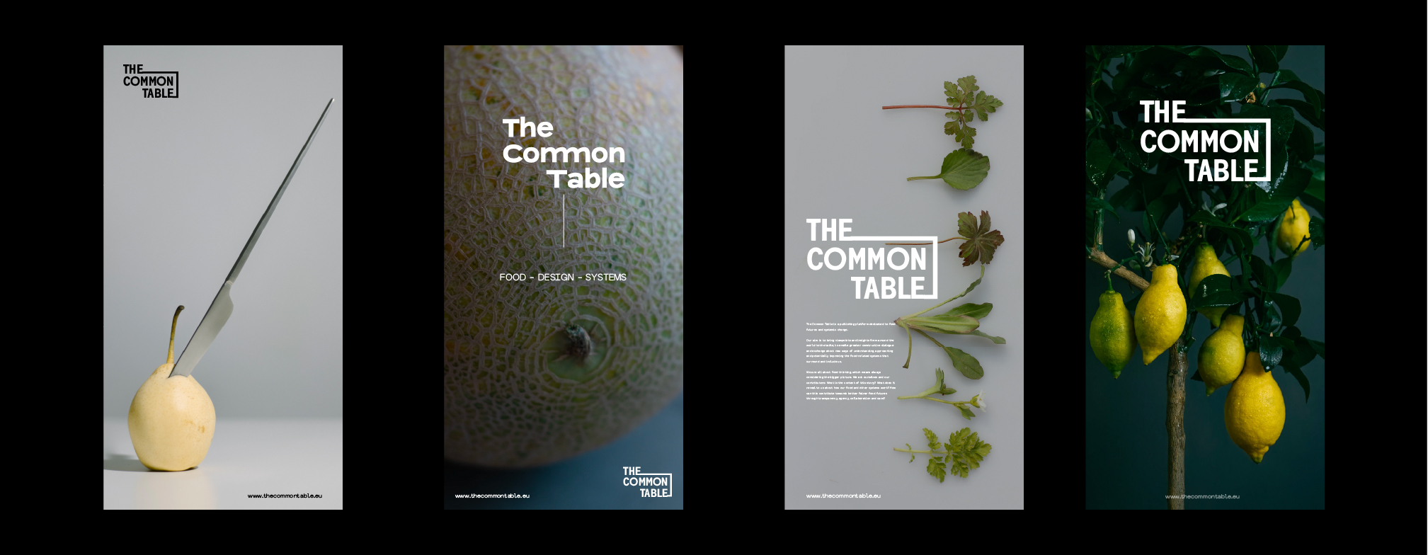
Crafted around “The Common Table,” the logo’s interlocking “E”s represent commonality and literally express the meaning of the word ‘common’. The minimalist black-and-white palette keeps the focus on content and clarity.
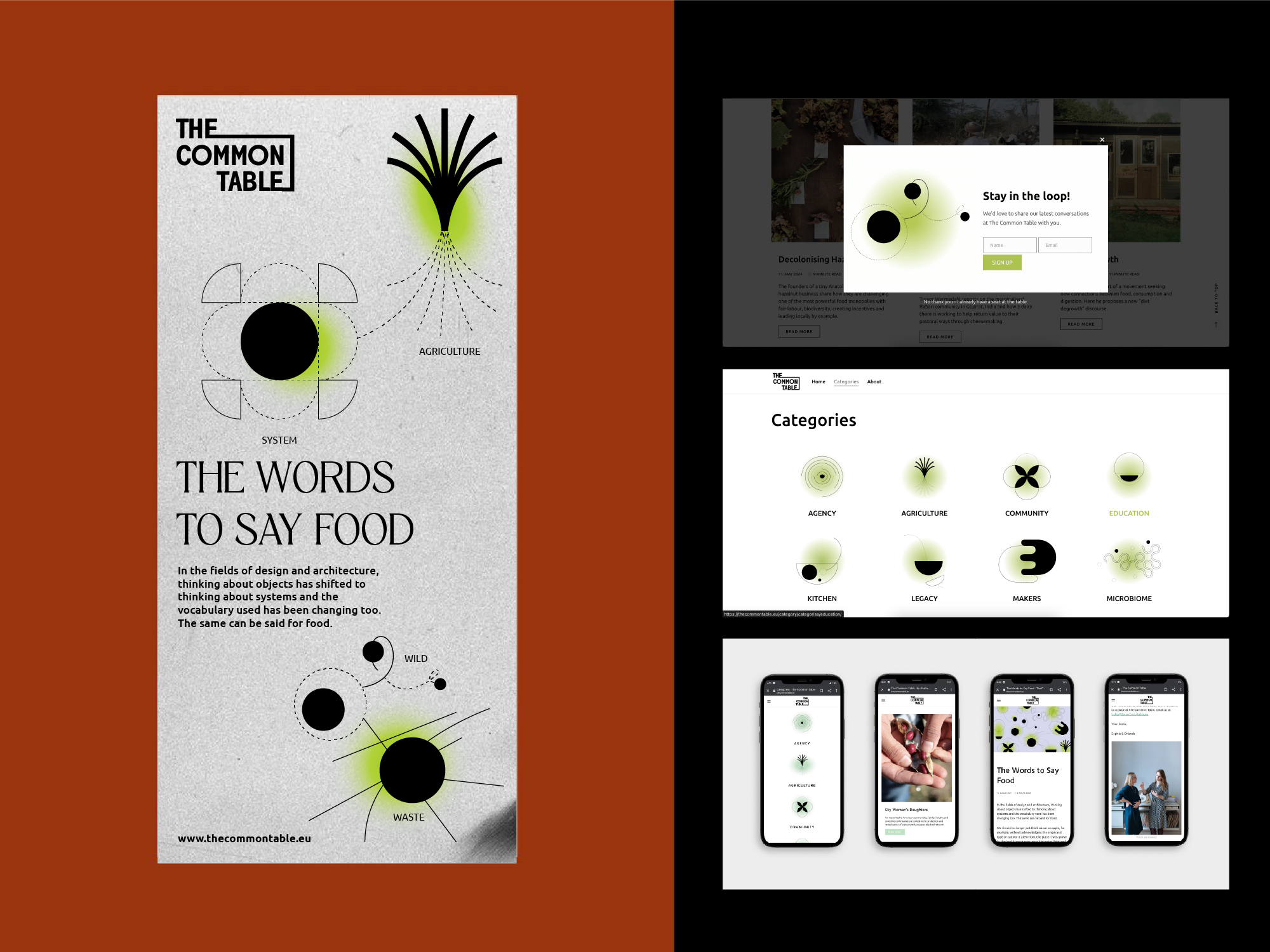
Pictogram System & UI
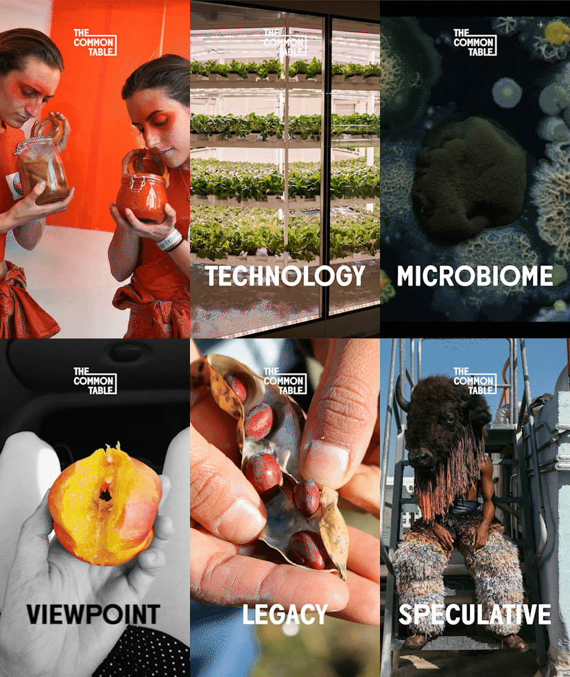
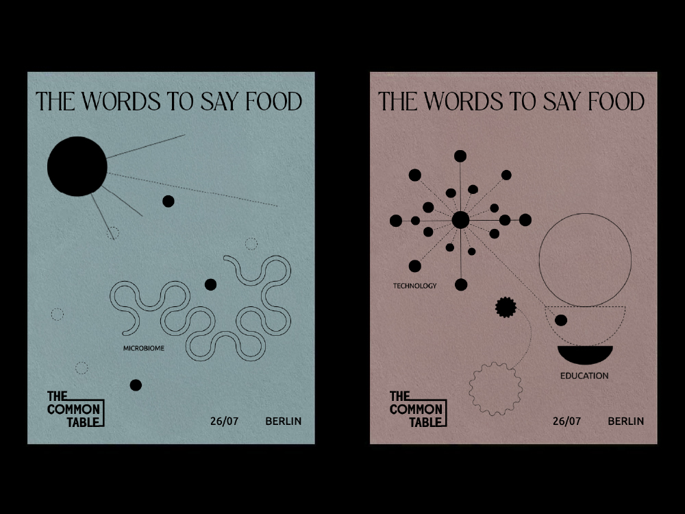
A pictogram design system was created to give each category an identity on the The Common Table website. The category system represents the first step in the process of finding new words for food. The clustered patterns and themes emerge through TCT’s conversations with food-future pioneers in a non-linear fashion, allowing stories to fall into two or more keyword groups, represented by the specially designed pictograms, which signify aspects of the food system. By being combined, like flavours, these words become enhanced, e.g. “SYSTEM AGRICULTURE”, “KITCHEN TECHNOLOGY” or “WILD WASTE”. Thus, the cycle of elements in and around the food system we live in are interconnectable in myriad ways.
Digital Experience
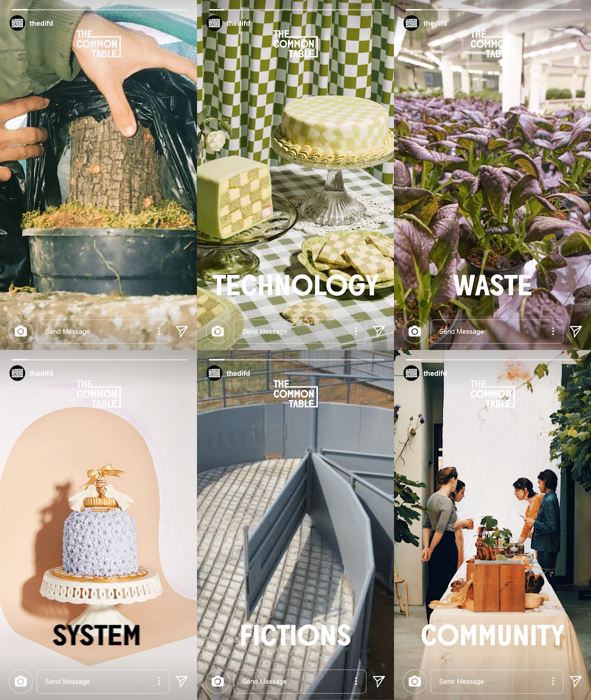
Extended design into responsive web layouts and social posts—creating a consistent, emotionally resonant visual language that makes food-system discourse feel approachable and human.
Why Emotion Matters?
Design is more than visuals it’s feeling. I leaned into emotion, celebrating the platform’s tone: curious, caring, and communal. Every icon and layout choice was informed by the desire for inclusivity, empathy, and trust.


Design Process Highlights
Research & Inspiration
Immersed myself in TCT’s global stories, even interviewed for an article and absorbed the complexity and richness in each narrative
Sketches & Iteration
Created dozens of logo and pictogram drafts, the intent was for the logotype to speak for itself. I prioritized simplicity to carry emotional weight without visual clutter.
Testing & Refinement
Shared prototypes with Sophie and Orlando, then fine-tuned based on their feedback, especially around tone, readability, and thematic clarity.
Implementation
Rolled out assets in Webflow, helped integrate into social channels like Instagram, and ensured visual coherence across platforms.
Impact & Reflection
- The identity reinforced TCT’s mission, making systemic food discourse more relatable and engaging.
- Users responded to the warmth and clarity: simplified access to big ideas.
Emotion became a design vehicle, turning complex concepts into relatable content.
Gratitude
Huge thanks to Ronak Naik and Harshad Satra for the invaluable collaboration, and to Sophie & Orlando Lovell for trusting me with this project. It was a privilege to bring your vision to life.


