(01)
Brand Repositioning, Packaging
Strategy & Design
Context:
Mintop is one of the most trusted names in hair regrowth treatments in India. But despite strong first-time sales, repeat purchases were staggeringly low. Consumer trust was faltering, especially with the Rx pack feeling deceptive due to oversized cartons that didn’t match product volume.
As Mintop prepared to launch a new OTC range, we were approached us to help solve two core problems:
- Rebuild consumer trust
- Create a clear system across 9+ SKUs
- Align with both doctor-led and OTC-led audiences
- Convert a medical routine into a lifestyle ritual
As visual designer, I worked with Studio 5B team, Mintop’s marketing and pharma stakeholders, and pharmacists in the field. My responsibilities spanned - Strategy & ideation workshops, packaging hierarchy & system design, Packaging design for OTC range, Supporting user testing, pharmacy studies, and co-design feedback sessions


(02)
Research & Immersion
We began with a cross-functional ideation workshop with Dr. Reddy’s pharma, marketing, and design teams. Then we conducted:
- Competitor benchmarking:
Market cues ranged from masculine, clinical packaging to overly traditional claims
- Pharmacy Perception Study :
in Mumbai, Delhi & Hyderabad
- Pack sizing dummy testing
with pharmacists and users
- Persona development
based on behavior, not just demographics
We found that:
- Pharmacists were de facto educators - Mintop needed clear, communicable design
- Consumers distrusted the large Rx box with its tiny bottle inside.
- The current SKU system was hard to decode
(03)
Brand Strategy
We repositioned Mintop as a
“believable, empowering lifelong companion in your hair regrowth journey”.
Tone of Voice: Motivational, calm, empathetic
Visual Keywords: Scientific, rewarding, honest, modern, stigma-free

(04)
Visual System:
Packaging + Identity
We focused on modernising the legacy of Mintop while retaining trust from its long-time user base.
This route preserved elements of the original inline typeface and elevated them with a cleaner, more contemporary visual system. The design now feels like a medical product that actually fits into your life, less intimidating, more empowering.
Key Design Fixes:
- We changed the dimensions of the oversized outer pack to match the bottle inside, removing the sense of deception.
- Restructured information hierarchy to guide usage and dosage better
- Added treatment timelines and symptom cues
- Maintained clinical clarity without being sterile

(05)
Mintop OTC Line
Here, we got to start fresh
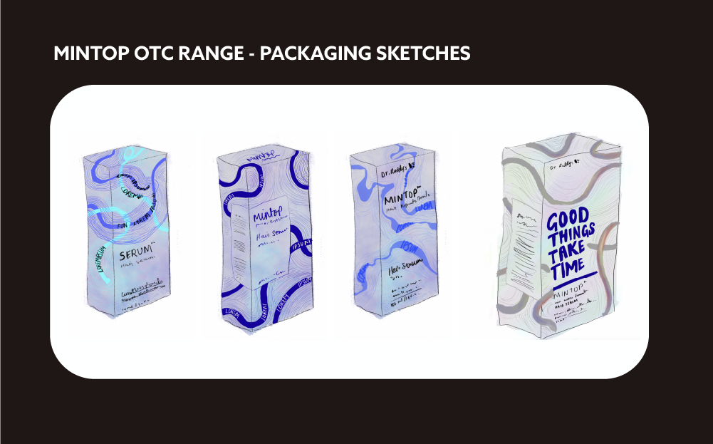
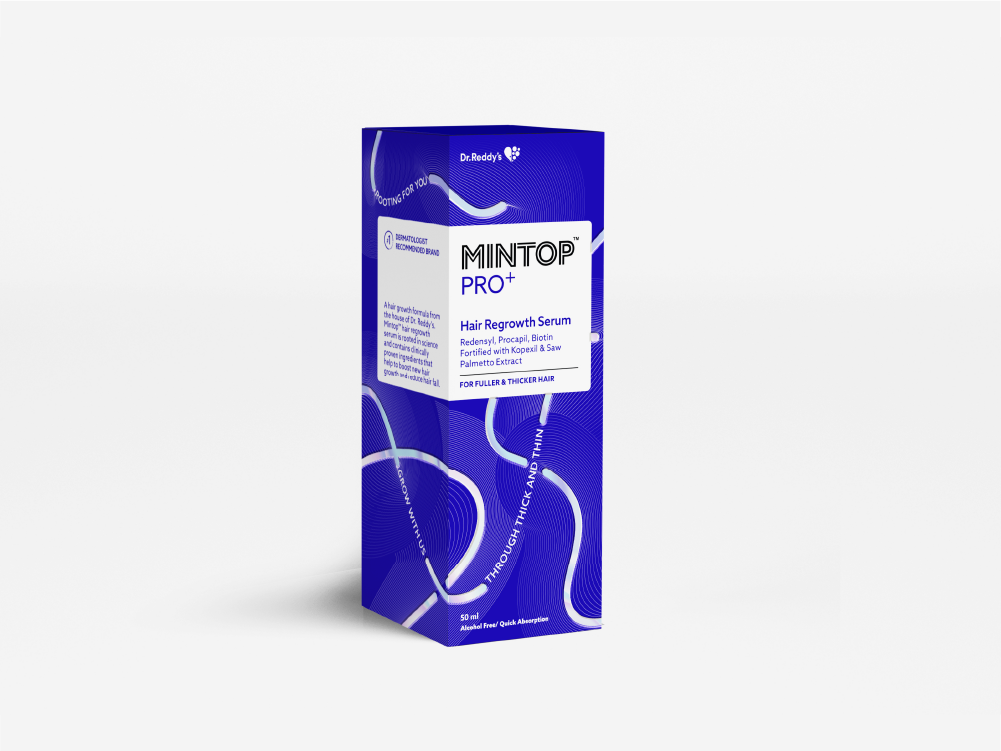
Concept: Thick, futuristic lines interspersed with conversational copy symbolise fuller, stronger hair—visually tying function into the form. The design builds around the idea of growth using circular bubble shapes (representing the shampoo format) intertwined with thick-thin lines (representing hair strands).
Design Features:
- Glossy embossed type gives the pack a tactile, premium feel
- A custom visual language made of repeating patterns doubles as both branding and storytelling
- Conversational microcopy on the pack makes it speak human, thus improving connection at the shelf level
- Variants are color-coded but unified with a shared visual system
The project was about designing clarity, empathy, and continuity for a customer who’s trying to make their hair regrowth journey a little less overwhelming.


(05)
User Testing & Validation
The visual system was tested through real-world trials with pharmacists and Mintop users. What worked:
- OTC variants were easy to distinguish on shelves
- Visual aids improved pharmacist communication
- Users said packs looked “reliable” and “non-intimidating”
Impact :
- Increase in repeat sales post-launch
- Positive sentiment from pharmacists and customers alike
- Internal teams used the new design system to train sales reps and update digital assets
Reflection :
This wasn’t just a redesign - it was a systemic repair of brand trust through design.
It showed me how deeply packaging influences user behavior, pharmacist communication leading to healthcare adherence. It also reminded me of the power of design systems to scale across functions, from marketing to pharmacy shelves.
Project Lead: Rupika Kumar
Design Strategy Lead: Anuranjini Singh
Design Team: RX - Omkar Purav, OTC - Neeraja Dhorde
Motion Storyboard: Divya Pepalla


